Evolving email: reply back in black
Evolving email is a series about putting yourself in the inbox of the recipient and getting more value out of the time you spend on the task of writing email.
* * *
Though I’m not sure of the precise history, at some point in the 1990s, popular email clients like Microsoft Outlook and its crippled sibling Outlook Express began to make use of rich text as the default for email composition.
Among the various and questionable benefits of rich text was the ability to use colored fonts. And soon after this ability was gained, the powers that be decided that email replies should happen in color by default. Namely, blue.
No, the “RE:” in the subject line wasn’t enough. Nor could the recipient of a reply be trusted to remember that they first sent the message. It was decided that replies must happen in color so that the recipient of a reply could be absolutely sure that they were reading a response to their own message.
The blue reply has probably saved millions of people from themselves by avoiding unnecessary confusion.
Of course, I joke.
It’s very likely that few in Outlook’s vast user base have ever questioned the utility of blue replies. Like so many other defaults bestowed by Microsoft, the blue reply became an unspoken common law.
That’s not to say there haven’t been deviants.
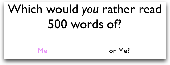
Some people have taken the concept of colored replies to more perverse heights. Instead of always replying in blue, they take advantage of an Outlook setting that sends each new reply in a different color. And no color, no matter how illegible, is off limits.
I remember a time when I emailed with a prominent exective who was doing this. When the messages started arriving in pastel shades of pink and purple (on a white background), I had to copy the text out of the email into a text file just to make it legible.
Like so many things in your technological life, just because you can doesn’t mean you should.
There is absolutely no utility in colored email replies. None. Not even blue ones.
Sorry if that makes me a colorless curmudgeon.
But think about it. Think about your recipient. No matter how neat and cute you think colored emails fonts are, the person reading them probably does not. They don’t care that today is Fuschia Friday. Would you?
The person that has to read your reply only cares about one thing: what you have to say. The easier you make your reply to read, the easier you’re making life for the person that sought your reply.
There is a reason that most web pages, novels, text books, pamphlets, and other media make use of a black font on a white background. It’s actually remarkably simple. It works. People can read it.
Black is more readable than any other hue on white – even blue believe it or not.
So I have a simple suggestion. Turn off colored fonts in your email client. Simply reply in a standard black font (some flavor of sans serif is ideal). Though you may feel like a radical at first, you’ll get used to seeing black on white when responding.
And trust me; no one will be confused.

