- I miss the positivity and information discovery in my feed
- I don't miss the negativity
On the bad design of everyday things
There's a door on the 10th floor of the Vox Media office I hate so much. I can never remember which way it opens, and I get it wrong every single time. You probably know one of these terror doors too. But it's not our fault.
God, I hate those doors. But I'm glad Vox hated them enough to talk about them with Don Norman in this video.
Creative versus predictable outcomes
No one ever innovated while working on what they were supposed to be working on. It can be difficult to accept that a well-designed task list represents everything that you should not do, if you want a creative outcome.
But for predictable outcomes, there's no substitute for practice, planning, and extreme discipline.
Our world needs both.
When the dark side of practicality defeats security
Maybe the high visibility of the "Apple vs. FBI" standoff has security on my mind more. I don't know. But a few days ago I decided to change my Apple ID password for the first time in a really long time. I'm still entering it.
The number of prompts on all my devices has been staggering. I know I shouldn't be surprised. I could walk across my home on iDevices if they were laid on the ground touching each other. We have 3 Macs in our home. And our Apple TVs... oh those I-love-them-and-I-hate-them Apple TVs.
Remind me how we ended up with five of them on our network?
And really the Apple TVs do offer the worst of all password experiences. Even though I can enter text with the iOS Remote app, it's still a chore. And many times I'm not even the family member who first encounters the password update prompt. "DAAAAD??!?!?!?"
All that to say, the Apple ID model leaves the security conscious among us wanting. Apple has good security intentions, and I believe my phone is secure. I have confidence in Apple's server security. But I don't have confidence in most people's will to use a strong password that they will have to enter 75 times after changing it, many of those times using a TV remote. I don't even have that confidence in myself.
Now excuse me while I reboot my Mac because a third party calendar app still can't seem to send my new password to iCloud.
Cave text
It's the year 3500. Anthropologists agree that 21st century progress was greatly impeded by a primitive communication technique called "PowerPoint bullets."
"It was a truly remarkable era," a leading scholar notes, "there were so many brilliant minds and technologies of the day. Yet so few people took the time to articulate their ideas in ANY form other than to throw crudely constructed sentence fragments onto 'slides' demarcated only by digital ink dots. It was as though their audience was only worthy of the most basic excrement of human communication."
On graphical morality: it takes two to lie
Dr. Drang's lifelong readers are well aware of his opinions on chart-making, especially his disdain for stacked area charts. For the record, I've generally agreed with Dr. Drang's criticisms, especially on charts with pseudo baselines—explicit or implied.
Not long ago, Dr. Drang poked Ben Evans in the eye over this issue after Ben tweeted a stacked area chart showing computer unit sales data. Ben predictably lashed back at Dr. Drang, as most people would after having the product of their livelihood called out in such an open place as Twitter.
In this instance, as an unemotional observer of this brief foodfight, I agree with Dr. Drang—or at least the spirit his argument (namely the pseudo baseline problem).
I have no reason to comment on this little spat other than to say it so perfectly snapshots the century-old debate on graphical deception.
In the introduction to Chapter Two, "Graphical Integrity," in his masterpiece The Visual Display of Quantitative Information, Edward Tufte deftly characterizes the tug-of-war in question:
For many people the first word that comes to mind when they think about statistical charts is "lie." No doubt some graphics do distort the underlying data, making it hard for the viewer to learn the truth. But data graphics are no different from words in this regard, for any means of communication can be used to deceive. There is no reason to believe that graphics are especially vulnerable to exploitation by liars; in fact, most of us have pretty good graphical lie detectors that help us see right through frauds.
Much of twentieth-century thinking about statistical graphics has been preoccupied with the question of how some amateurish chart might fool a naive viewer. Other important issues, such as the use of graphics for serious data analysis, were largely ignored. At the core of the preoccupation with deceptive graphics was the assumption that data graphics were mainly devices for showing the obvious to the ignorant. It is hard to imagine any doctrine more likely to stifle intellectual progress in a field. The assumption led down two fruitless paths in the graphically barren years from 1930 to 1970: First, that graphics had to be "alive," "communicatively dynamic," overdecorated and exaggerated (otherwise all the dullards in the audience would fall asleep in the face of those boring statistics). Second, that the main task of graphical analysis was to detect and denounce deception (the dullards could not protect themselves).
With these words, Tufte equitably distributes the responsibility for visual truth-telling on the graphic's creator and its audience. The lesser the weight of evil intentions on one side of the scale, the smaller the moral heft required of the other. But neither side should ever be exonerated from their responsibility to transmit or translate the truth.
Tufte wraps up his introduction to Chapter 2 of the book by shifting his sermon back to the graphical creator, who is obviously his audience in the book:
Deception must always be confronted and demolished, even if lie detection is no longer at the forefront of research. Graphical excellence begins by telling the truth about the data.
And this is how we—that is, everyone in the world who has chosen or been chosen to communicate data through graphics—should go from here. All we can do is prioritize truth-telling. Our audience's reception of the truth will never be entirely within our control.
In many ways knowledge is a curse. But the more we know of the psychological traps of the human mind, the more responsibility we have not to lay them.
Decision time
Being highly productive is mostly about making common sense decisions about how to use your time. Secret one is allocating time to making those decisions on a yearly, monthly, weekly, daily, and sometimes twice-or-more-per-day basis. Secret two is not being fooled into thinking decision making is a waste of time. Secret three is being able to realize when past decisions where wrong or when new decisions have to be made as actual events replace expected events.
Twitter update
An update on my planned iPhone absence from Twitter:
No. 2 is winning. I know less about Donald Trump's day-to-day affairs and gun violence than I have in ages. For that, I couldn't be happier.
Copied: shared clipboard for iOS and OS X
Copied is really useful if you want a way to copy/paste between an iOS device and your Mac. I heard about it from Federico Viticci.
You'll need both the iOS and Mac versions. It syncs through iCloud. If I copy a chunk of text from a PDF, for example, that I'm reading on my iPad, it immediately places that text on my Mac's clipboard. I mean, like, immediately. It's so great.
Dimming Twitter
Twitter Benefits: It's an unrivaled source of information and connections with people whose interests are similar to mine.
Twitter Costs: I look at it all the time.
Net value added: Negative (probably). While it's impossible to quantify what I've paid in time and attention lost, I'm highly suspicious that these costs outweigh the benefits of information discovery.
The decision: I'm deleting all Twitter apps from my iPhone, the device on which I check Twitter most often. The fact that it seemed so crazy to do so makes me even more curious how this experiment will turn out.
I am not ready to quit Twitter entirely. Just ready to evolve how I use it. I'm leaving it on my Mac and iPad(s). For now.
The last resource
As your tools and expertise asymptotically approach perfection, your resource set asymptotically reduces to time available. The value of your time approaches infinity.
To achieve greatness in any pursuit is to manage time with as much awareness and skill as humanly possible. No technological innovation will ever diminish the value of clocks and calendars. They only become more important with time.
Deliveries
Deliveries, which I discovered through Bradley Chambers's review, is an app that makes shipment tracking way easier with almost no extra effort on your part.
My favorite feature is being able to forward a shipment notification email right into their June Cloud service, which grabs the tracking information right out of the email. It can even use the order number in the initial email Amazon sends after an order—making it totally uncessary to look at any other Amazon emails that follow.
The June Cloud service is smart enough to parse emails with multiple orders, too—or parse a single order involving multiple shipments. For example, the other day I bought some Balega socks from Amazon in several colors, which weren't all available to ship at the same time. Deliveries figured that out and split it into three entries, each with their own tracking status.

Deliveries solves real, if First World, problems. Now I have to rely far less on email shipping notifications, setting manual reminders, and worrying that I might totally lose track of something I ordered—especially during the holidays. One other nice benefit: getting a notification each time something is delivered to my door step—super useful if something shows up while I'm out of town.
The Apple Watch Eight Months Later
David Sparks doesn't think the Apple Watch is going away:
I wear it every day and use it to keep up with my fitness goals, set alarms and timers, check my calendar, listen to podcasts, turn on and off the lights, get directions, text my kids, and checkoff tasks. Oh yes … I also use it to tell time. This is the most useful watch I’ve ever owned. I put it on when I wake up in the morning and take it off when I go to bed. (That’s right, I even keep it on while I’m in my pajamas.)
I'm glad I'm not the only one. One other worth mentioning: it's the most useful weather checker ever devised.
So much more than a desk
Check out Thomas Borowski's beautifully conditioned and practically-modified Action Office I rolltop desk. So cool. So beautiful to look at. So easy to forget that it was the precursor to the Action Office II, which accidentally sent corporate office design spiralling hellward.
For years, I've been fascinated with sociological factors that lead to the standard workplace—particularly the cubicle farms that became so prevalent by the end of the 20th century.
The cubicle, which is now in so many ways an icon of misery and corporate servitude in the United States, is an extreme perversion of Robert Propst's 1960s Action Office II concept. In fairness to Propst, he never intended for the Action Office to turn into the cubicle anymore than Mikhail Kalashnikov intended the AK-47 to become a symbol of terrorism. But sometimes that's how things work out.
By the way, if you're interested in the mid-20th century factors that created the sociological conditions necessary to rationalize the horror of things like cubicles, read The Organization Man by William H. Whyte (1957). It is an exquisitely written masterpiece.
For a more modern and more specific take on the sociology of 20th century office design, Cubed is a great and easy-to-read choice.
And probably most entertaining (and deep) of all, read Venkatesh Rao's 2009 masterpiece, The Gervais Principle, for a journey through the personality structures that coalesce around office structures situated on stacks of cubicles. Warning: this one will change you.
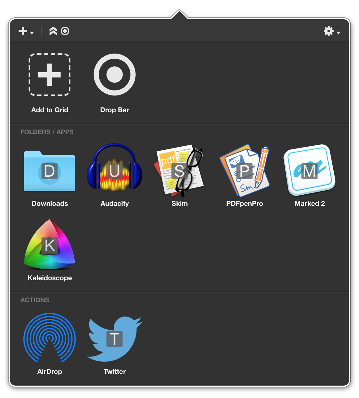
Dropzone
Dropzone is the best Mac app I discovered in 2015. It works like the "drop stack" feature in Path Finder, but it's available in the menu bar. I use it every day to gather files to attach to emails, open PDFs in specific apps, and more.
Truth in magic
"Once you know the truth, you just can't go back... and magicians know the truth..."